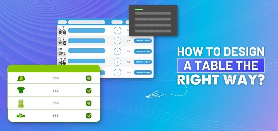
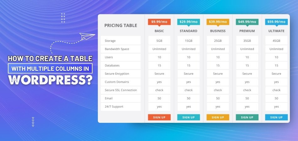
How to Design a Table the Right Way?
The way you design a table can have a big impact on how people interpret your data, even though it may seem like a simple task. You may already be thinking about the layout, colors, and fonts, and wondering, “How to design a table the right way?”
Design a table the right way by setting a clear purpose, using short headers, aligning content neatly, adding light visuals, and testing for clarity. Good tables help readers understand data faster through a clean layout and smart structure.
If you're curious about building tables that look clean and work well, you're in the right place. This article shares all the key tips, tools, and things to avoid when making tables that are easy to read and understand. Keep reading—you’ll find everything you need.
How to Design a Table the Right Way?
Designing a table might sound simple, but doing it right makes a big difference. A good table is more than just rows and columns—it helps people understand things faster. Let’s look at what really matters when building one.

Table’s main purpose
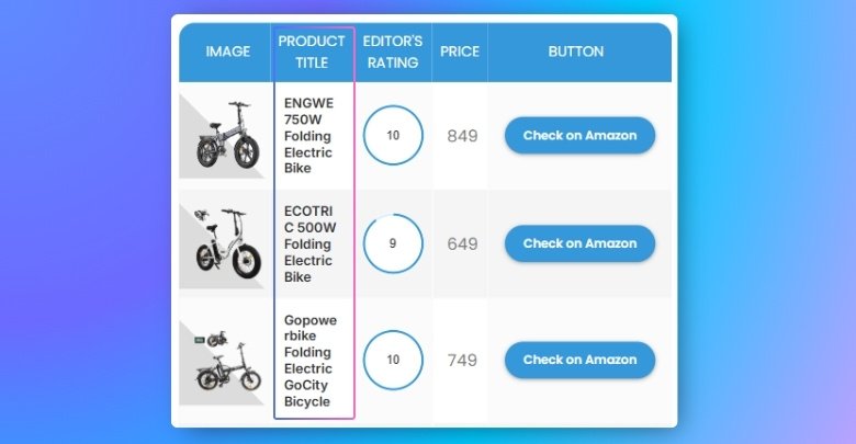
Every table should have a clear reason behind it. Think about what the table is supposed to show and how people will use the information. Make sure the most important columns come first, and group similar data together. Keep the format the same across all rows to avoid confusion. Whether it’s for pricing details or comparing items, building your table around its goal keeps it clean and useful.
Clear column headers
Great tables use short, clear words for column headers. These help people know exactly what each column means without guessing. If someone is scanning quickly, these headers guide them to the right spot. For example, instead of just “Value,” use “Monthly Value ($).” Bold text or background shading can also help the headers stand out. Clear headers are like road signs—they point users in the right direction with no extra effort.
Easy-to-read layout
Making a table easy on the eyes is important. Striped rows or light lines between rows can help people follow across wide tables without getting lost. Use enough space between rows so everything doesn’t look squished. Numbers look best when lined up on the right, while words usually sit better on the left. Simple fonts and soft background colors also make things easier to follow.
Helpful visual cues
Subtle details like light borders or background shading can make sections easier to see. These hints help guide the user’s eyes across the page. Try not to use too many bold lines or bright colors—it can feel too heavy. Just a bit of color can highlight key rows or totals. Small things like this keep your table organized while helping people find what they need faster.
Smart features
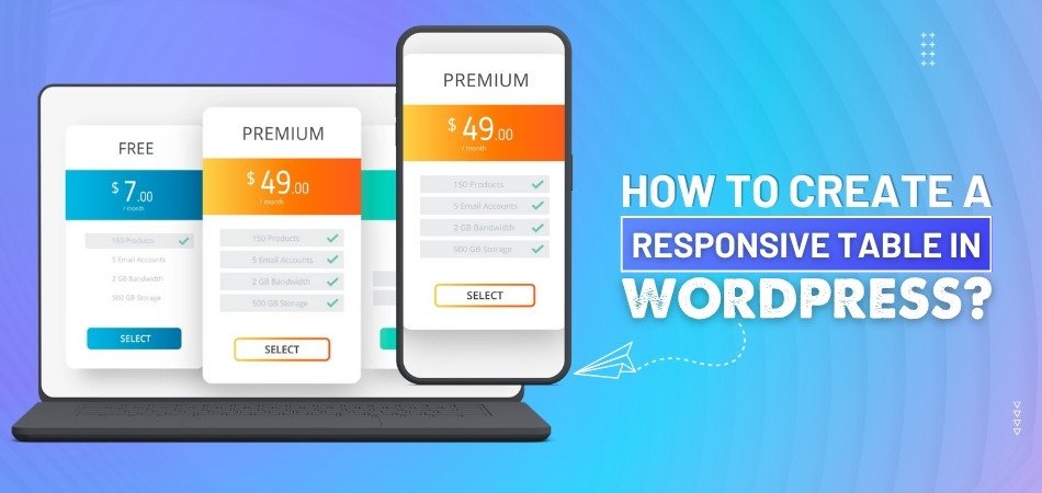
In larger tables, adding features like filters or search bars can save time. People love it when they can quickly sort the list just by clicking the column header. Also, let users resize columns if the content feels tight. This comes in handy for things like WordPress responsive tables, where space can change on smaller screens. These smart tools make the table feel flexible without making it hard to use.
Clean and simple rows
Avoid repeating the same labels again and again—it adds clutter. If the table has repeated info, try to merge the cells only when it really helps people read better. Too much merging can confuse things. Think about using horizontal lines instead to separate sections. These steps keep your table looking neat and make it faster to scan.
Tested by others
It helps to let someone else try your table before you share it widely. What makes sense to you might confuse others. Ask someone to check if the table is easy to use, if the columns are clear, and if they can find what they’re looking for. Sometimes, small changes based on feedback can really improve how the table works for everyone.
A well-designed table does more than just hold information—it helps people understand it quickly. By focusing on clarity, structure, and usability, you make the data more useful. Even small improvements can have a big impact. So, next time you build a table, take a few extra minutes to do it right.
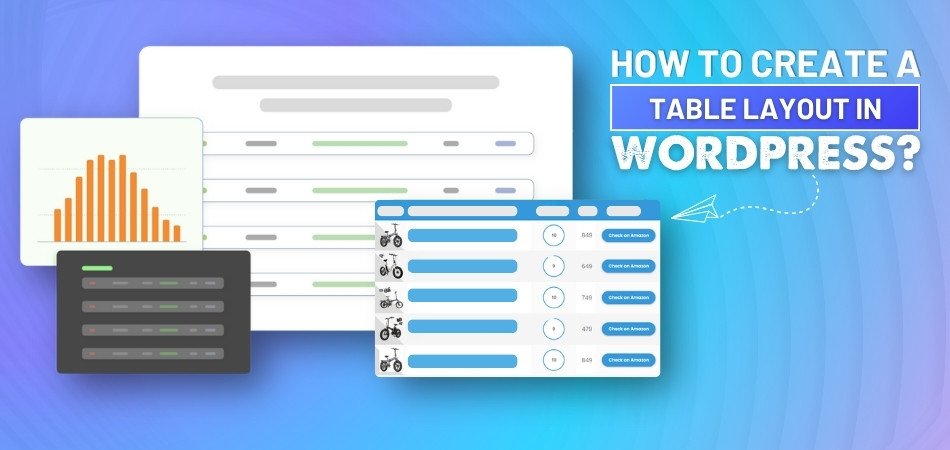
How Can You Simplify Dense Information in Table Design?
Tables are great for showing a lot of information in one place. But when they get too packed, it becomes hard to read and understand. A messy table can make people skip important parts without noticing. Read these simple ideas to make your tables cleaner and easier to follow.
Keep It Short
Long lines of text make tables look heavy and hard to follow. Try cutting extra words and only keep the most useful ones inside. Use small phrases or single words instead of full sentences. This makes it quicker for someone to scan and understand what they see. You don’t have to remove useful info—just shorten how it's shown. A little editing goes a long way in making your table simpler.
Use Smart Highlights
Adding bold text or soft colors helps the eye focus faster. You can use highlights to point out the most important details. This way, readers can find the key parts without much effort. Just make sure not to use too many styles at once. Too much color or boldness can get confusing. Keep the important parts clear, but let the rest stay plain and simple.
Split Big Chunks
Instead of loading everything into one giant block, split the info into smaller parts. This helps the eye follow things better. You can also space things out more by adjusting rows or columns. Sometimes, using multiple columns in tables makes it easier to show extra details without making a single area look heavy. It’s not about adding more—it’s about spreading things out smartly.
Group Related Items
When items that belong together are placed far apart, it feels messy. You can fix that by keeping related data close to each other. This way, the brain connects the dots faster without confusion. It saves time for readers who want to understand quickly. It also makes your table feel organized and less random. A clean layout helps everyone find what they need faster.
Add Clear Headings
Headings should tell readers what each part of the table is about. Pick simple and clear words to label every column or row. Avoid using confusing terms that people may not understand right away. If a heading is long, try making it shorter without changing the meaning. The goal is to guide readers quickly without making them guess. Headings are like signs—they show where to look.
Simple tables save time and make reading more comfortable and clear. When a table looks clean, people want to read it fully and easily. Always think about how others will view and understand your layout. Make small changes that help big understanding with just a few easy steps.
Things to Avoid When Designing a Table
Creating a table sounds easy, but there are a few things to watch. If you don’t plan it well, it might look messy or confusing. Tables should help people read information quickly without making them feel lost. Keep reading to learn what to avoid when designing a table.
Too Much Text
Long sentences inside a table make it hard for people to read. When every cell is full of words, the table starts looking crowded. Readers will get tired if they have to search for key points. Try using short phrases or just a few words per cell. That way, your table stays clear and neat without extra clutter. Clean layouts are always easier to understand and more pleasant to see.
Tiny Font Size
Many people think a small font helps fit more data in a table. But if the text is too small, no one will want to read it. Everyone should be able to understand the table without zooming in. Use a size that’s easy to see from any screen or paper. Keeping your font readable makes a big difference in your design. Good tables always put comfort before squeezing in too much stuff.
No Headings
When tables have no clear headings, they quickly become confusing and unclear. Readers won’t know what each row or column is talking about. That makes it harder for people to use the table properly. Headings help organize the table and show what each part means. Without them, even the most useful data becomes hard to follow. Always label rows and columns so the message is easy to catch.
Too Many Colors
Some people like adding lots of colors to make tables stand out. But too many colors often make it hard to focus on the content. It can distract the reader and make the table look messy or loud. Stick to two or three simple shades for a cleaner layout. Use color only when it helps show something important. Less color makes it easier for people to follow what’s written.
Bad Column Spacing
Poor spacing can ruin the look and feel of your entire table. If the columns are too close, the words start to overlap and mix. If they’re too far, the table looks broken and uneven. You should keep spacing even so that everything is easy to scan quickly. Good spacing helps the eyes move smoothly across the table. A balanced layout makes the table more useful and nicer to look at.
Tables work best when they are clear, clean, and well-spaced. Avoiding common mistakes can help you create better and smarter designs. Keep your table readable, simple, and easy to understand for everyone. Smart design makes your information easier to use and share.
Essential Tools to Help You Create Well-Designed Tables
Designing a good table takes more than just filling rows and columns. You need the right tools that make the work easier and the table look better. With the right help, your table can look clear and organized. Let’s check out some useful tools you can try.
OneClickTable
This tool makes building tables feel quick and simple from the start. It has a drag-and-drop setup that helps users place data without much hassle. You don’t need extra skills to create something neat with this one. It also works great with basic styles, keeping everything clean. If you care about how everything lines up, it supports table layout design too, which can improve your overall look naturally.
TablePress
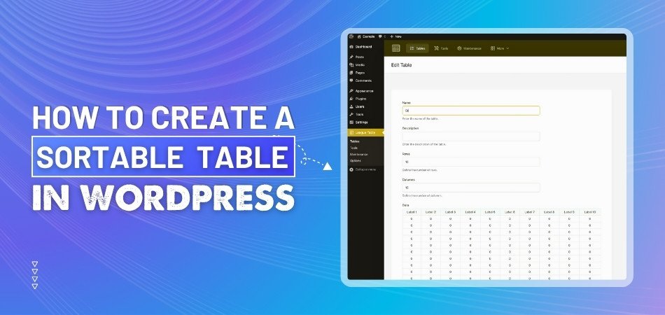
People like this tool because of its easy-to-use design and smooth features. You can build large or small tables without feeling stuck at any step. It works directly inside WordPress, so it’s great for websites. The editing tools are simple but powerful, making updates really fast. Even if you want to organize long lists of items, this tool keeps everything tidy and well managed.
WP Table Builder
There’s a reason this one is called a builder—it lets you shape tables your way. You can add images, text, or buttons into the table with just a few clicks. It feels more like designing than coding anything hard. It’s perfect when you want to mix different types of content. The preview feature is helpful, so you can check your work before posting it online.
Data Tables Generator
This one stands out when you need smart filters and search bars in your table. People who need advanced features often choose this tool for better control. It helps break big information into smaller parts that people can sort easily. Even though it gives you strong options, the setup still stays clear and is not confusing. That balance between power and ease is what makes it special.
Visualizer Plugin
If you want more than just tables, this tool also lets you add charts. You can turn boring data into colorful visuals with only a few steps. It also helps when comparing numbers across rows or columns. Whether it's simple or fancy, the results look smooth and easy to read. You can save different styles and apply them again later without starting from scratch.
Each tool here brings something helpful for building better tables fast. Choosing one depends on how simple or detailed your table needs to be. With the right tool, your design can stand out more easily. Cleaning tables always helps people understand your message better.
Frequently Asked Questions
Here’s a short FAQ section to help with extra things you might still be thinking about. These questions cover some smaller but important parts that didn’t get much attention in the main article. If you want your table design to be the best it can be, don’t skip these!
How Can I Choose the Best Font for My Table?
Pick a font that looks clean and is easy to read quickly. Simple fonts like Arial or Roboto usually work well in most cases. Avoid fancy or decorative fonts—they may look nice but are hard to scan. Use the same font for the whole table so everything feels connected.
What is the Best Way to Show Totals in a Table?
You can show totals by adding a clear row at the bottom of the table. Use bold text or a soft background color to highlight it. Make sure it's placed right after the numbers it sums up. This helps readers spot totals without having to look too hard.
Should I Add Notes Below a Table?
Yes, if your table has special meanings or extra tips, notes are helpful. Keep the notes short and place them right under the table. This way, people can understand things better without getting confused. Use a smaller font so the notes don’t take too much attention.
Is It Okay to Add Images Inside a Table?
Yes, adding small images like logos or icons can be helpful. Just make sure they don’t make the table hard to read. Place them in a way that doesn’t block the text or layout. Keep them small and meaningful so they add value, not clutter.
How Do I Keep a Table Mobile-Friendly?
Use fewer columns and make sure text doesn’t overflow the screen. Choose a tool that lets tables adjust to smaller screens easily. WordPress plugins like responsive table builders are a good choice. Always test the table on a phone or tablet before sharing.
Can I Use Borders for Every Cell?
You can, but using borders for every cell might feel too heavy. Instead, try light lines for rows and columns to keep things neat. Strong borders should be saved for total rows or important parts. Keeping it simple helps people read the table more easily.
What’s the Best Way to Show Dates in a Table?
Use a format like “May 10, 2025” or “10 May 2025” for clarity. Make sure all the dates follow the same format from top to bottom. Avoid shortcuts like “10/5” because they can be read differently. A full, simple format keeps the meaning clear for everyone.
Should My Table Be Centered or Left-Aligned?
Left-aligned tables are easier for most people to follow, especially for reading text. Centered tables may look nice, but they can be harder to scan. If your table has mostly numbers, center-align just the numbers. Always focus on what feels easiest to read.
Can I Mix Different Data Types in One Table?
Yes, but you should group similar types of data next to each other. Mixing text, numbers, and icons is fine if it’s organized well. Use clear headers so people know what each column is about. Avoid jumping between too many types in one small space.
How Do I Make Sure My Table Matches My Website Design?
Use the same colors and fonts as your website for a clean match. Keep background colors soft so the table blends in nicely. Avoid adding new styles that look out of place on your page. A matching table helps your whole page look more professional and connected.
Final Words
Designing a clean and helpful table takes more than just adding rows. From choosing clear headers to spacing things neatly, every part matters. Now you know the key steps on how to design a table the right way?—by keeping it simple, clear, and useful.
Before wrapping up, here are a few final tips: always check readability, test your table on different devices, and avoid extra colors or clutter. Thanks for sticking with the guide—wishing you the best in designing your next smart, user-friendly table!

_348.jpg)