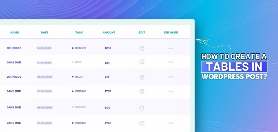
How to Create a Responsive Table in WordPress?
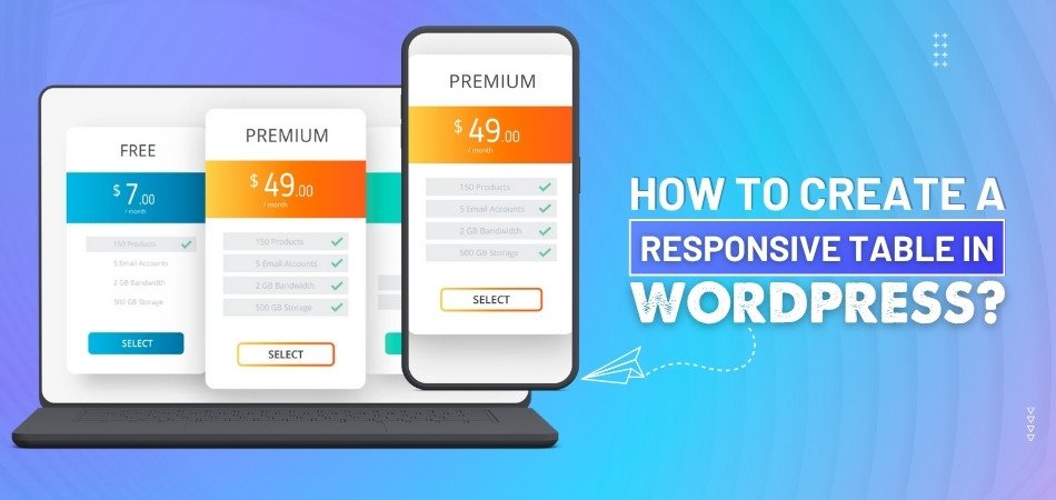
Creating responsive tables in WordPress is essential for ensuring your content looks great on all devices. No matter how you present data, lists, or other information, responsive tables ensure a smooth experience on phones, tablets, and desktops. This leads to a common question: How to create a responsive table in WordPress?
To create a responsive table in WordPress, you can use plugins like One Click Table, TablePress, or WP Table Builder. Besides, you can manually add HTML and CSS or use the WordPress block editor. Try testing the table on as many devices as possible to make sure it works across all platforms.
The following sections will take you through each part of the process of designing the perfect responsive table. So stay with us.
How to Create a Responsive Table in WordPress?
Having a responsive table in WordPress is important because it ensures that your content looks good on all screen sizes, whether it's on a phone, tablet, or desktop. Here's how you can easily make one:
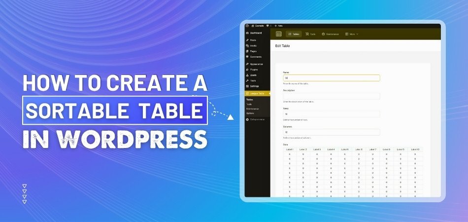
Choose a Table Plugin
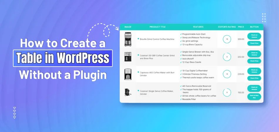
The easiest way to make a table in WordPress is by using a plugin or tool. One simple tool is oneclicktable, which has ready-made table designs you can choose from. Just pick a table, change it how you like, and copy the HTML code to use in your WordPress page or post. If you want to use a plugin, some good ones are TablePress, WP Table Builder, and Data Tables Generator. These let you build tables without needing to know any coding.
Manually Add HTML and CSS
If you prefer coding, you can manually create a table using HTML and CSS. First, write the HTML code to structure the table, such as defining rows, columns, and headings. Then, use CSS to make the table responsive, like adding media queries to adjust the table’s appearance on smaller screens. This method gives you complete control over how your table looks, but requires some basic knowledge of HTML and CSS. It is a flexible option if you are comfortable with coding.
Use the WordPress Block Editor
WordPress’s block editor also has a built-in table block. Simply add a table block to your page or post and start filling in the content. While the table block is quite basic, you can use custom CSS or plugins to make it responsive. You can adjust the number of rows and columns as needed. This method is ideal if you want a simple table without using any extra plugins.
Make Tables Scrollable on Small Screens
If you have a large table with lots of data, you can make it scrollable on smaller screens instead of shrinking the content. To do this, you can add custom CSS that will create a scrollable table within a set width. This ensures the table doesn’t break or become too small on mobile devices. Adding the right CSS rule will allow users to swipe left or right to view all the content without cluttering the page.
Use Table Responsive Plugins
Some plugins are specifically made for responsive tables. These plugins automatically add features like sorting, filtering, and pagination, which can make large tables easier to navigate. With plugins like Data Tables Generator, tables automatically adjust to the screen size and provide additional functionalities. These plugins are especially useful if you're managing a lot of data and want your tables to look professional.
Adjust Table Settings for Mobile
Another way to make your table responsive is by adjusting table settings within your WordPress theme. Many modern themes come with responsive features built in. You can adjust the theme’s table settings to ensure that your table resizes well on mobile devices. Check if your theme has any options for responsive table settings in the customization area. This can save time and give your table a more polished look.
Preview and Test
Once you create your responsive table, it's important to test it on different devices. You can preview your table on a desktop, tablet, and mobile phone to see how it looks. If you notice any issues, go back and adjust your settings or code. Testing ensures that your table will be easy to read and navigate, no matter what device your viewers are using. Always double-check before publishing to avoid surprises later.
Why Use a Table Plugin and Tools Instead of Coding?
Using a table plugin or tool in WordPress is an easy way to create responsive tables without coding. These tools provide ready-made templates and customizable options for building tables. Here’s why using them might be a good idea:
- Ease of Use: Plugins provide a simple interface, making table creation quick and easy. No coding knowledge is required to start.
- Prebuilt Templates: With plugins, you get access to prebuilt templates. These templates can be customized without any hassle to fit your design.
- Time Efficiency: Plugins save you time by automating the process. You can create complex tables in just a few clicks.
- Responsiveness: Many table plugins are designed to adjust to all screen sizes. This ensures your tables look great on mobile devices.
- Customization Options: Table tools offer customization, allowing you to change colors, fonts, and structure. It lets you design a table that fits your website’s theme.
- No Need for Coding: You don’t have to write HTML or CSS when using plugins. The tools do all the hard work for you.
- Advanced Features: Plugins often come with advanced features like sorting or pagination. These features make managing large tables easier and more interactive.
- Support and Updates: Most table plugins are regularly updated and come with support. You’ll get assistance if you encounter any issues.
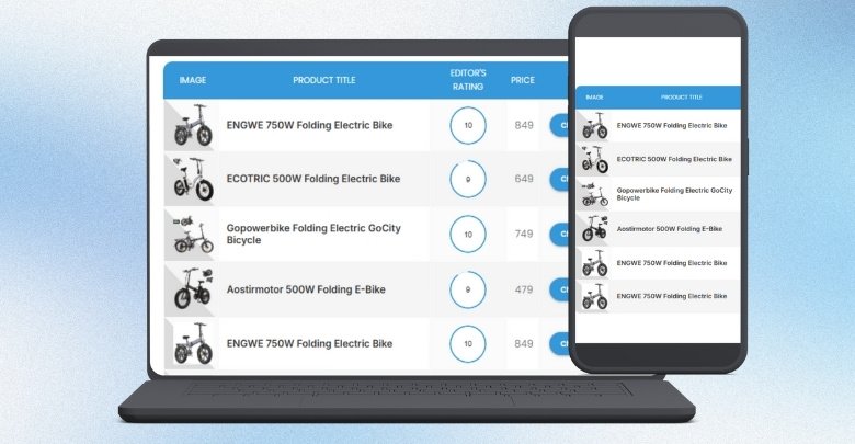
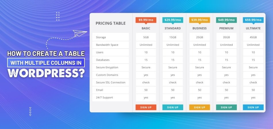
Which Table Layouts Work Best Across Devices in WordPress?
When adding tables to your WordPress site, it's important to ensure they look good on all devices. Different layouts can help make tables easy to read on phones, tablets, and computers. Choosing the right layout ensures your visitors can view your content without any issues. Let's explore some layouts that work well across various devices:
Scrollable Tables
Scrollable tables allow users to swipe left or right to see all the content. This is especially useful when your table has many columns. Instead of shrinking the text, the table stays the same size, and users can scroll to view hidden parts. This layout keeps the table neat and prevents it from looking cluttered on small screens.
Stackable Tables
In stackable tables, each row turns into a block on smaller screens. The headers become labels on the side, making it easy to read on phones. This layout is helpful when you have important information that needs to be clearly displayed. It ensures that all data remains accessible without horizontal scrolling.
Collapsible Tables
Collapsible tables hide less important columns under a toggle button. Users can tap the button to view additional details. This keeps the table clean and focused on essential information. It's a great way to present data without overwhelming the viewer.
Modal Tables
Modal tables show extra information in a pop-up window when a row is clicked. This method keeps the main table simple and uncluttered. Users can choose to view more details only when needed. It's an effective way to manage large amounts of data on small screens.
Flip Tables
Flip tables, swap rows and columns to better fit narrow screens. This method is often used when adding a Bootstrap table in WordPress, as it helps with mobile viewing. This layout can make certain data easier to compare on phones. However, it might not work well for all types of tables. It's best used when the flipped format enhances readability.
Paginated Tables
Paginated tables divide content into multiple pages. Instead of displaying all rows at once, users can navigate through pages. This prevents long tables from becoming overwhelming. It's useful for organizing large datasets in a user-friendly way.
Most Common Uses of Responsive Tables in WordPress
Tables are a great way to organize information on a website, so it's easy to read. When they are responsive, they work well on phones, tablets, and desktops. You can use them in many ways depending on your content. Keep reading to see where responsive tables are most helpful.
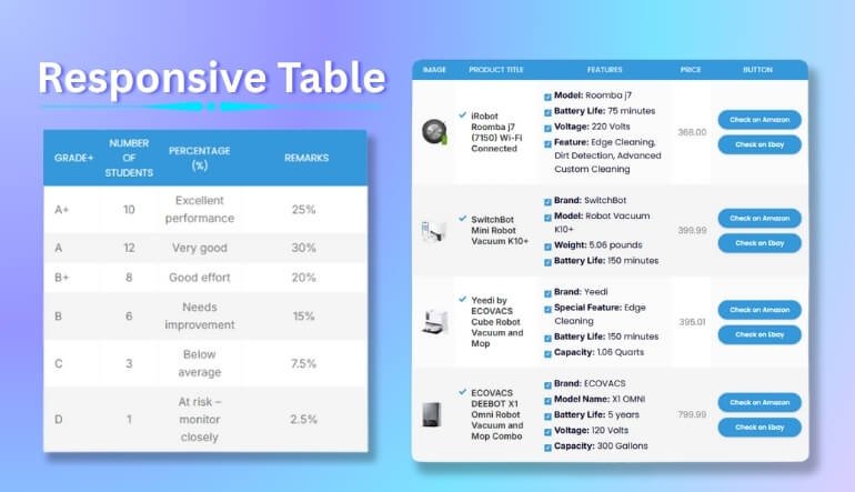
Price Comparisons
Many websites use tables to show the differences between products or plans. This helps visitors compare features, prices, or services easily. Everything is lined up in rows and columns, making it super clear. With responsive tables, users can view this comparison on any screen size without confusion. It's a clean and simple way to help people decide what to pick.
Product Features
Tables are perfect for showing product features in a neat format. You can list items side by side to show what each one offers. This layout works really well when you have many items with similar details. Responsive tables keep the design readable even on small screens. It’s a good way to show helpful information without making it look messy.
Event Schedules
Event times and dates fit perfectly in a table format. You can list sessions, speakers, or activities hour by hour or day by day. This makes it easy for visitors to find what they’re looking for at a glance. A responsive table will keep this info clear even when viewed on a phone. That way, no one misses any important event details.
Data Lists
Tables are also useful when showing long lists of information, like names, numbers, or stats. It keeps everything organized and easy to read. Instead of typing out data in paragraphs, you can show it in rows and columns. Responsive design helps users scroll through the list without getting lost. This is a better option than a large block of text.
Weekly Menus
Restaurants or food bloggers often use tables to show daily or weekly menus. It’s a great way to list meals by day or category. This helps visitors quickly find what’s available on a certain day. On a mobile screen, the table can scroll or stack for easier reading. It keeps the menu looking neat and tasty at the same time.
Timetables and Calendars
Schools, transport websites, or service centers use tables to share time-based info. These tables show when something starts, ends, or repeats. It’s a good way to keep things in order without confusing the viewer. Responsive tables make sure the times and dates stay easy to read on phones. So the schedule is always clear no matter where it’s viewed.
Ways to Test Table Responsiveness on Devices
After creating a table in WordPress, it’s important to make sure it works well on all screen sizes. A good table should look clean and easy to read on both phones and computers. There are simple ways to check if your table is working right. Here are some simple ways to test it.
Use Browser Resize
One easy way to test your table is by resizing your browser window. Just grab the side of the screen and make it smaller. You’ll see how the table changes as the screen gets narrow. If the text squishes or disappears, it might need fixing. This quick test gives a clear view of how your table behaves.
Check with the Inspect Tool
Most browsers have a tool called "Inspect" or "Developer Tools." You can right-click on your page and choose “Inspect” to open it. Then, switch to the mobile view to see how your table looks on different devices. You can try screen sizes like iPhone or tablet views. It helps you spot any layout issues easily.
Try on Real Devices
If you have a phone or tablet nearby, open your website on it. Scroll through the page and check how the table looks and works. See if the text is readable and fits the screen. It’s always a good idea to test on real devices, not just on your computer. This gives you a better idea of what users will see.
Use Online Tools
There are free websites where you can test your site’s look on many screen sizes. Just paste your website link, and it will show you how your table appears on different devices. Some tools even let you click and scroll through the table. This is helpful if you don’t have many devices to test on. Here are some online tools that can help you test the responsiveness of your tables in WordPress:
- Responsinator
- Screenfly
- Am I Responsive?
- BrowserStack
- LambdaTest
- Infyways Responsive Checker
Look for Scrollbars
A responsive table should allow side-scrolling if it’s too wide. Check if a horizontal scrollbar appears when needed. If the content gets cut off instead of scrolling, the table isn’t responsive. Scrollbars make sure users can see all parts of your table, even on small screens. It’s a simple thing, but very important.
Test Column Wrapping
Sometimes, columns should wrap or stack on smaller screens. This means the data shifts into a new line to stay readable. If your table gets too squeezed and hard to read, wrapping might be missing. You should test to see if your table handles this well. A wrapped table can look much better on a mobile device.
Tips for Managing Large Tables Without Losing Responsiveness in WordPress
Large tables can be hard to manage in WordPress, especially if you want them to be readable on every device. With the right strategies, you can keep your tables responsive while still displaying lots of data. Let’s explore some tips to help you with this.
Break Into Pages
If your table has lots of rows, break it into pages. This means showing only a few rows at a time, like 10 or 20. Visitors can click to see the next page, which keeps the layout clean. Many plugins offer this feature with just a few clicks. It helps your page load faster and stay easy to read.
Add Scroll Option
Tables that are too wide can be hard to fit on a phone screen. One solution is to add a scroll bar that moves sideways. This works especially well when you're using a table with multiple columns, so nothing gets cut off. Users can swipe left or right to view all the data. Most plugins support this with just a small setting.
Use Column Priority
Not all columns are equally important. You can choose to show the most important ones first and hide the rest on small screens. These hidden columns can still be seen using buttons or toggles. This makes the table smaller and easier to use. Focus on the details people really need to see.
Group Similar Data
If you have repeating info, try grouping it to save space. For example, combine rows that share the same name or category. This makes the table shorter without losing any meaning. Grouping also helps readers understand the content more quickly. It’s a simple way to clean up large tables.
Try Toggle Rows
Toggle rows let users click to open more details in the same row. You can keep the main info visible and hide the extra stuff. When someone clicks, more text or numbers appear below. This keeps the table short and neat at first glance. It’s great for mobile screens and long data sets.
Choose a Good Plugin
Some plugins are better than others for handling big tables. Look for one that supports scrolling, paging, and responsive layouts. A good plugin will adjust the table for any screen size. It saves you time and effort by doing the hard parts for you. Pick one that fits your needs and is easy to use.
Frequently Asked Questions
If you're looking for more detailed answers about creating responsive tables in WordPress, this section covers some frequently asked questions. These FAQs go beyond the basics, providing deeper insights into handling tables effectively on your WordPress site.
How Can I Add Images to a WordPress Table?
You can easily add images to your WordPress table by inserting them in individual table cells. Most plugins, like TablePress, allow you to use the image URL or upload it directly. When using the block editor, just add an image block inside a cell. Always make sure images resize properly on smaller screens.
Is It Possible to Add Buttons Inside a Table?
Yes, adding buttons inside a table is simple with many plugins. You can insert buttons using shortcodes or HTML tags inside table cells. This is useful for things like “Buy Now” or “Read More” actions. Just make sure the buttons also work well on mobile views.
Can I Use Shortcodes Inside Tables?
Absolutely, shortcodes can be added inside most table cells if you're using WordPress plugins like TablePress. This lets you display dynamic content like forms or pop-ups. It's a great way to add extra features inside a table. Always test the output on mobile devices to make sure it works.
What Is the Best Way to Style Table Borders?
You can style table borders using the table plugin's built-in design tools or by adding custom CSS. Use simple borders so your table doesn't look too heavy. Make sure border colors match your site's theme. Keep things clean for a better user experience.
How Do I Highlight a Specific Row or Column?
You can highlight specific rows or columns by using custom CSS or plugin styling options. This is helpful if you want to draw attention to important data. Choose a soft background color or bold text for that part. Always test it on different screen sizes to make sure it looks good.
Can I Add Sort and Filter Options to a Table?
Yes, plugins like Data Tables Generator or TablePress let you enable sorting and filtering. This is great for long tables where users need to find data quickly. These options also make your table look more interactive. Make sure they're easy to use on phones as well.
What Happens if My Table Has Too Much Text?
If your table has lots of text, use line breaks or limit how much you show per cell. You can also use toggle rows or pop-ups for extra info. Avoid stuffing too much into one cell, especially on small screens. Clean layout always makes reading easier.
Final Thoughts
Your content will be easy to read on any device when you create responsive tables in WordPress. Whether you're showing prices, schedules, or lists, a clean table layout makes a big difference. Plugins like TablePress, WP Table Builder, or oneclicktable offer easy ways to build and customize tables without coding. For those who prefer more control, using HTML and CSS is also an option. The key is testing your table across screen sizes and using smart layouts like scrollable or stackable formats.
When you know how to create a responsive table in WordPress, you can display data without confusing your visitors. With the right approach and tools, your tables will look neat, work smoothly, and perform well on all devices.

_348.jpg)