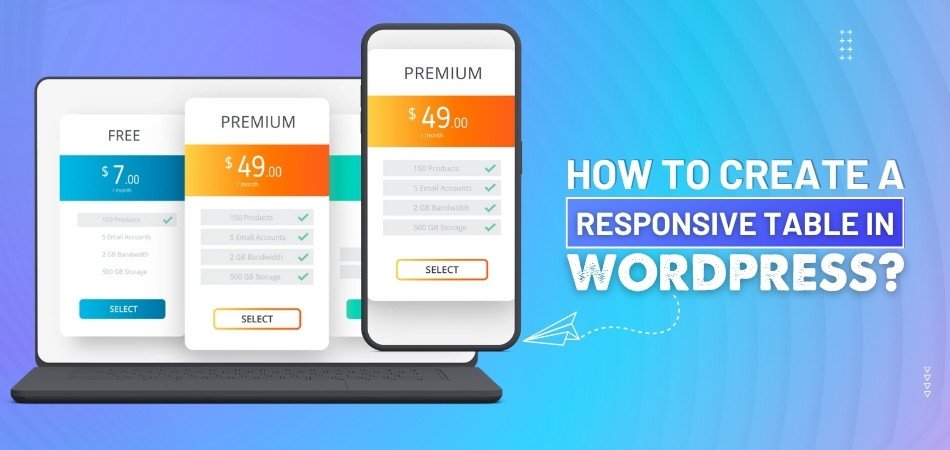
How to Make Bootstrap Table in WordPress?
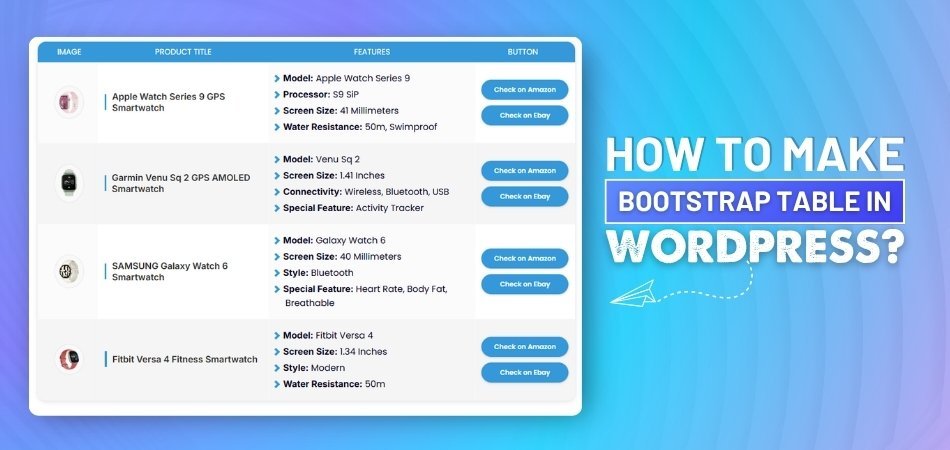
When arranging a lot of data on websites, bootstrap tables are a wise choice because of their well-known simplicity and clean design. Many WordPress users often wonder how they can set up these tables in their own pages or blog posts. You might be one of them, trying to figure out how to make Bootstrap table in WordPress?
Make a Bootstrap table in WordPress by adding HTML code in a Custom HTML block or using a plugin that supports Bootstrap styling. This method gives you a clean layout, responsive design, and full control without needing extra themes.
If you're thinking more about tables and how they work in WordPress, this article covers everything clearly. From the tools you can use to the design features that matter, you'll find every key point explained. So keep reading to get helpful details that make things much easier.
How to Make Bootstrap Table in WordPress?
Using tables in WordPress is a great way to display clean data in your blog. It helps when you want to compare things or list them neatly. It doesn't require any coding skills, and it's so easy that it might be worth a try today. Continue reading to learn some easy ways to do it.

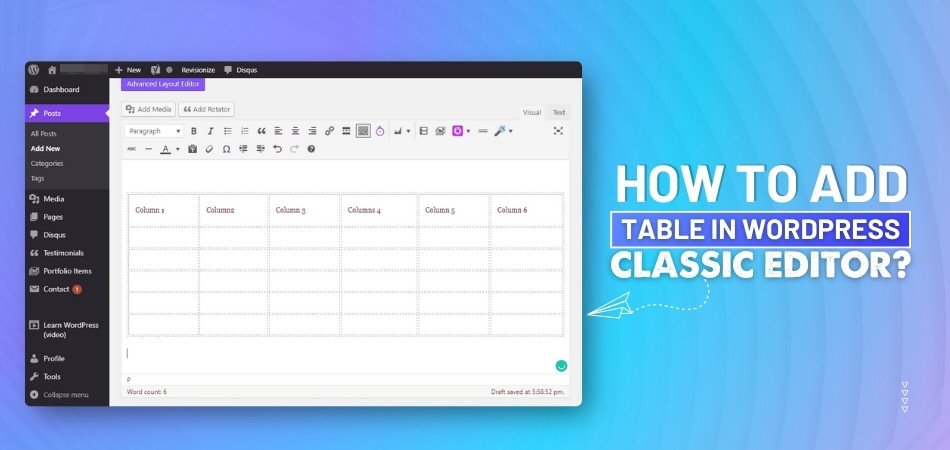
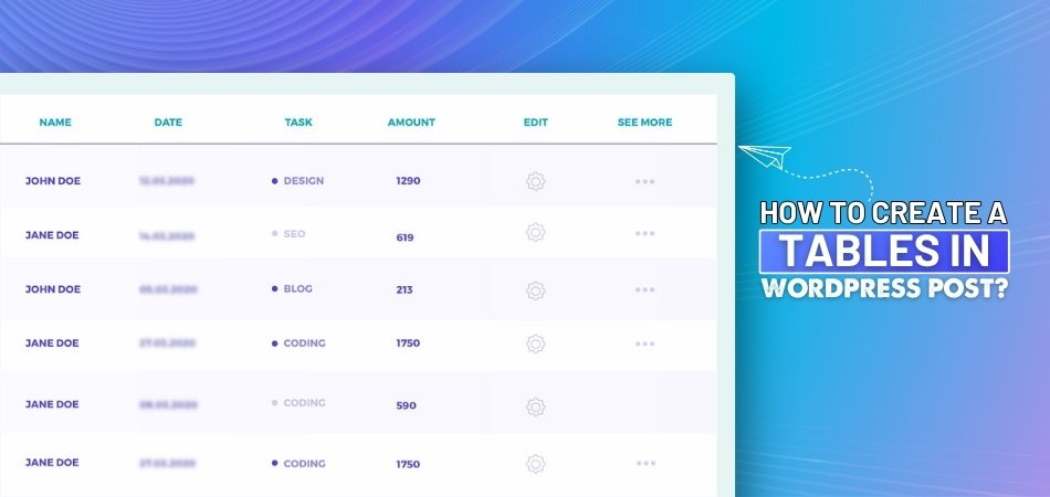
Table Block
WordPress has a built-in table block that works with a few clicks. You just search for it, choose the size, and fill in each cell. This block is good for small tables like price lists or schedules. You can also align text and adjust rows easily. It’s simple, clean, and doesn’t need anything extra to use. If you want fast results without plugins, this is a great choice.
Use of Plugins
Many people choose plugins because they offer more styles and controls. These tools often come with ready-made layouts, filters, and design tools. You can highlight rows, add links, or sort data easily. Plugins save time and look better on your site. They also help you handle bigger or more complex tables. If design matters to you, plugins give more freedom and control faster.
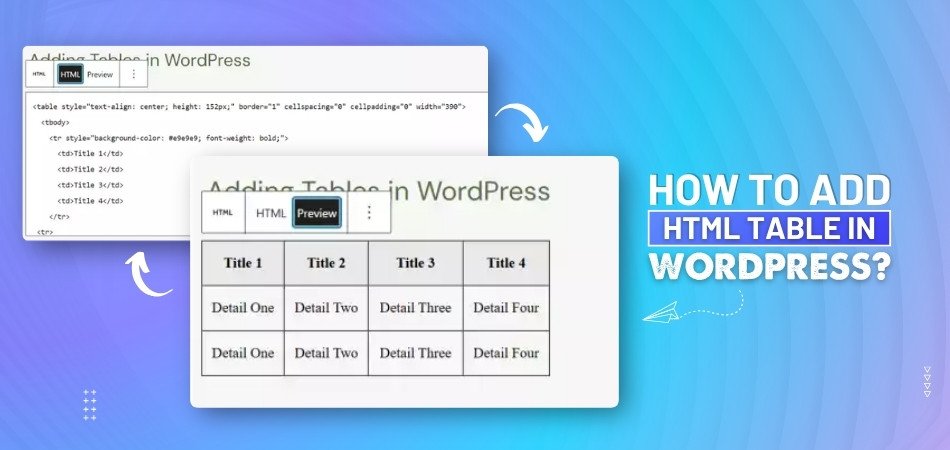
Custom HTML
Some users like writing their own code to make tables by hand. The “Custom HTML” block in WordPress lets you do this easily. It takes a little more time, but it gives you full control. You can adjust every part, like borders, colors, or spacing. This is good if you want something very specific. You don’t need a plugin, but a little code knowledge helps here.
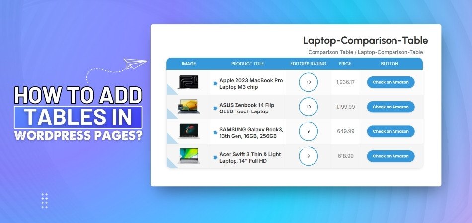
Prebuilt Table Tools
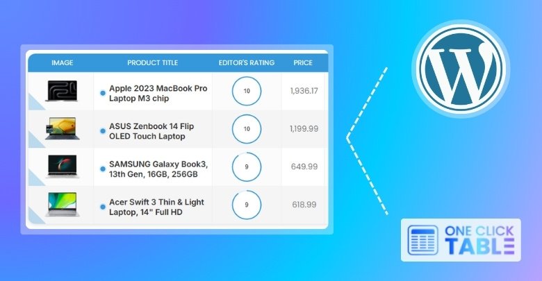
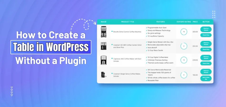
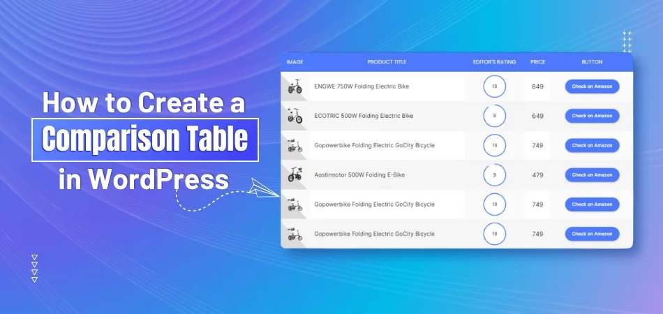
For those who want fast and easy table creation with many design options, some tools work really well. OneClickTable is one of those smart tools that let you create comparison tables, pros and cons boxes, and more, all in seconds. It offers many styling options in color, text, and call-to-action buttons, without needing extra setups.
Styling Options
Changing the look of your table helps it match your website better. You can adjust text size, background colors, and border styles easily. Some plugins let you choose from design themes and layouts too. When a table looks neat, it becomes easier to read and understand. Making it look nice also makes people stay longer on your page. Try small changes and see what looks best.
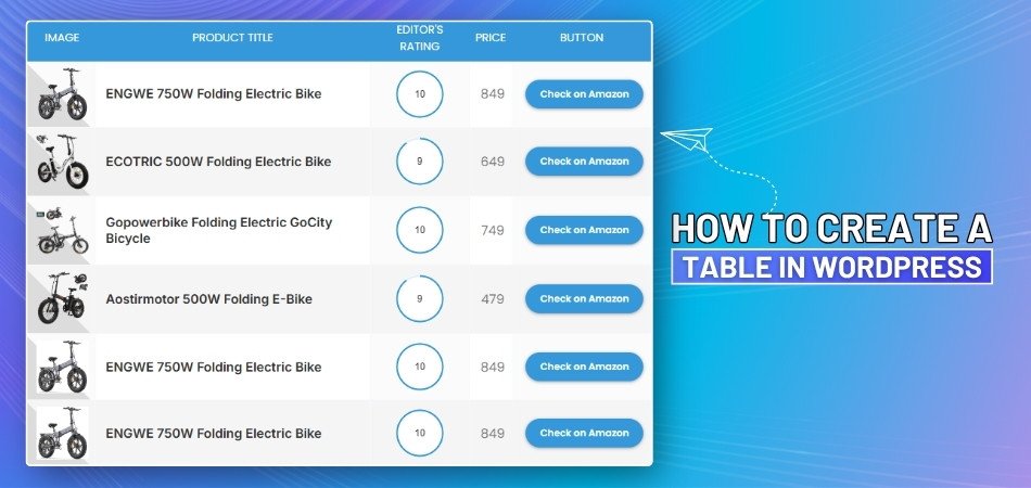
Adding Media
Putting images or icons in a table makes things clearer. You can show product pictures, small icons, or labels in each box. This helps people understand the content faster without reading everything. Some tools allow drag-and-drop media support for this feature. Others need you to paste image links inside the cell. A good-looking table with pictures can really make your page stand out.
Keep It Responsive
Whatever method you pick, always make sure your table looks good on phones as well. Responsive tables adjust their layout so people don’t have to scroll sideways. Plugins and some tools give this feature by default, while manual tables might need extra tweaks. A table that works on all devices gives your readers a better experience.
Tables help make content easier to read and understand for everyone. You can use basic blocks or try plugin tools based on your need. Pick the method that feels simple and looks good on your site. Try once, and you'll get better at it every time.
How Do WordPress Tables Affect User Interaction and Time Spent?
Tables in WordPress are more than just boxes filled with data. They help shape how a website looks and how people interact with it. Good tables can keep users interested and guide them through the page easily. If you want to improve your website’s user time and flow, read on.
Clean Page Layout
Visitors enjoy reading when everything looks neat and well-organized on screen. A clean table can help break big chunks of text into small, readable parts. It also helps the site look tidy, which feels nice to the eyes. People often stay longer when they can quickly spot useful information. That’s why a well-structured table makes a real difference to user behavior. It’s one of the easiest ways to improve your site’s layout.
Easy To Read
Many readers don’t enjoy scrolling through large paragraphs of text online. A table gives short and clear information without needing too much reading. Each row can show a point, making it easy to scan quickly. With good spacing and alignment, tables reduce the effort needed to read. Users often stay longer when they find content simple to follow. That’s why using tables can improve reading time on your website.
Better Click Actions
Some people leave websites fast if they can’t find links quickly. Tables can fix this by putting buttons and links right into each row. That makes it easy for someone to take action without thinking much. For example, clicking a “Buy Now” or “Learn More” button feels smooth. You can also guide users from one table cell to another page. This helps increase clicks and keeps users active on your website.
Keeps Users Focused
Websites can feel too busy if the content looks mixed up. Tables help keep things in line so visitors don’t get lost. When things are listed clearly, users don’t need to search too hard. They stay focused on what matters and skip what’s not needed. That focus helps reduce bounce rates and increases time spent on the page. It also improves how they feel about using your website overall.
Visual Balance
Plain text can make a page look boring or hard to follow. Adding a few tables makes the whole layout easier on the eyes. When users see different blocks of content, they feel less overwhelmed. A mix of text and tables keeps their attention for a longer time. It gives the page a better balance without too much design work. That’s one reason why tables can help people stay longer on your site.
Tables help your website look cleaner, faster, and easier to understand. They guide visitors to stay longer and take helpful actions easily. A simple table can make a big difference in user experience. Try using one on your page and see how it works.
Why Do Some Bootstrap Tables Break on WordPress Mobile View?
Some websites look perfect on desktop but messy on phones. When that happens with tables, users may feel confused and leave quickly. This problem is common in WordPress sites using Bootstrap without mobile tweaks. Let’s look at why it happens and how to fix it.
Fixed-Width Columns
Fixed column widths can cause problems on mobile devices when using Bootstrap tables in WordPress. These columns don't adjust to smaller screens, leading to content overflow and layout issues. To ensure your tables are mobile-friendly, it's important to set appropriate column widths.
Here are some common column width settings:
- Auto Width: Use the “.w-auto” class to allow columns to adjust their width based on content.
- Fixed Width: Apply the .table-fixed class to set a fixed width for all columns, making the table layout more predictable.
- Minimal Width: Utilize “.th-sm or .th-lg” classes to set a minimum width for table columns, ensuring they don't shrink below a certain size.
- Grid Classes: Implement Bootstrap grid classes like “.col-3, .col-6”, etc., to define column widths relative to a 12-column grid system.
By adjusting these settings, you can create a better table layout that looks good on all devices.
Missing Breakpoints
A lot of table issues come from ignoring device breakpoints during design. Bootstrap has features that help adapt content for different screen sizes. If breakpoints are not used, the table stays locked in one format. On phones, this can lead to strange overlaps or shrinking text. Making sure each device has a custom style solves many problems. Designers should always check how the table looks on multiple screens.
Overloaded Rows
Rows with too much content can make your table fall apart on mobile. Long sentences or large images force the table to stretch sideways. That ruins the whole layout and makes reading difficult for users. Breaking content into shorter pieces or stacking it vertically can help. A better way is to keep things short and clear in each row. That helps your table in the mobile look clean and easy to scroll.
Theme Conflicts
Sometimes, table styles get messed up because of your WordPress theme. Some themes have strong styles that override Bootstrap’s default design. This can break things like padding, borders, and row spacing. If your site uses a custom style or plugin, check for conflicts. You might notice that the design shifts, even if the code seems fine. Testing the same table in another theme can show if this is the issue.
Table Wrapping Issues
When tables don’t wrap properly, users struggle to view them on phones. It often happens when the table layout is not mobile-friendly. This can even happen when you try to build a quick table layout in WordPress without checking mobile settings. Adding extra rows or not setting width rules can cause broken views. It’s always safer to test the table on a mobile screen before publishing it live.
Broken mobile tables can ruin a visitor’s experience in just seconds. Paying attention to width, breakpoints, and wrapping can avoid that. Always test tables on different devices before posting. A few small tweaks can make a big difference.
Quick Bootstrap Table Creation Tools for WordPress Sites
Building tables in WordPress doesn’t have to be confusing or slow. There are tools that make the work faster and cleaner, even for beginners. These tools offer simple setups and helpful features. Keep reading to explore some of the easiest and best options.
OneClickTable
This tool is great if you want something fast and powerful. OneClickTable lets you build tables like product boxes, top lists, or review boxes in seconds. It offers many ready-made layouts you can edit easily. You can change the look using colors, fonts, buttons, and more. It’s also useful for people who want stylish designs without writing any code. Many users like it because it works smoothly across different devices and themes.
WP Table Builder
If you prefer drag-and-drop tools, WP Table Builder is a strong choice. It helps you create tables with text, images, buttons, and ratings. You can also bring in data from files like CSV or XML. While it doesn’t use Bootstrap by default, you can still adjust the design using your own CSS. It works well with the WordPress block editor and is simple to set up.
Ninja Tables
The purpose of Ninja Tables is to provide users with additional features and control. It supports Bootstrap 3 and 4, which means your tables can match your site’s style easily. You can add sorting, filters, and even connect it with WooCommerce. It’s very helpful when working with big data lists. This plugin is also known for being clean and responsive, which makes it perfect for mobile users.
TablePress
One of the most popular table plugins is TablePress. It’s useful for adding tables that need features like sorting and pagination. You don’t need to know any coding to use it. While it doesn’t have Bootstrap built in, you can still add styling using Bootstrap classes. It’s a simple plugin that works for many websites, especially for displaying clear and neat data.
wpDataTables
This tool is great for showing large sets of data or charts. wpDataTables lets you add info from Excel files, Google Sheets, and more. You can change the look, filter the data, and even add charts. It supports Bootstrap styling, so your tables can blend well with the rest of your site. It’s a smart pick if you need data tools and visuals together.
Creating tables doesn’t have to feel tricky or take too much time. These tools help you design clean and useful tables with just a few clicks. Each one has different strengths based on what you need. Try one today and make your site look more organized.
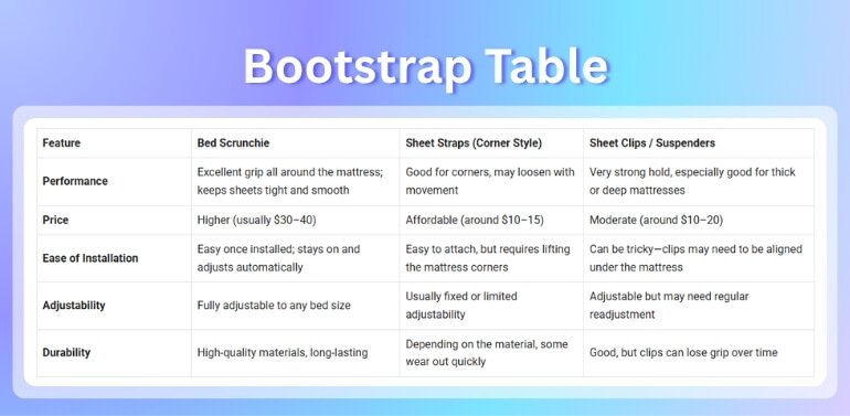
What Features Should You Focus on When Using Bootstrap Tables?
Many websites show data in a table format to keep things clean and readable. Bootstrap tables help make that easier, especially when you want control over the style. But to get the best results, certain features really matter. Let’s go through the ones you should look out for.
Clean Formatting
Good tables should look neat and simple, even with a lot of data. Using proper padding, borders, and spacing makes each row easier to read. You should avoid putting too much in one row, as it can feel messy. Also, use clear headings to explain what each column means. All of these small details make the table look more polished and helpful without confusing the viewer.
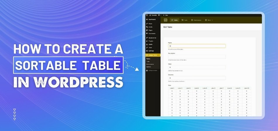
Sort and Filter
There are times when you have long lists in your table. Having options like sorting or filters helps people find what they want faster. Sorting means they can arrange the list by name, date, or price. Filters allow them to hide things they don’t need to see. These tools make the table more user-friendly and save time for everyone using it.
Easy Pagination
When tables grow too long, it’s hard to scroll and follow everything. That’s where pagination comes in; it breaks the table into small, easy-to-read parts. Instead of showing all rows at once, users can click through pages. This keeps your table tidy and keeps your page from feeling crowded. Many Bootstrap plugins already support this feature to make life easier.
Mobile-Friendly Fit
Sometimes people open your site on phones or small screens. If your table doesn’t adjust well, it becomes hard to read. So when designing, make sure the layout can shrink and still look okay. In situations like this, using a responsive table design helps your content adjust automatically without breaking the style or cutting off text.
Custom Styling
Not all tables need to look the same. You might want to match your table colors, font sizes, or button styles with the rest of your website. Bootstrap gives you tools to do that easily without messing up the layout. It’s better to choose light colors for large tables and make sure clickable parts stand out clearly from normal text or data rows.
Bootstrap tables work great when they look simple and function well. Try not to add too much at once, or the table might look messy. Focus on making the data easy to read. These small features can make a big difference.
Frequently Asked Questions
If you’re curious about making Bootstrap tables in WordPress but have some extra questions, this section is here to help. We’ve picked the most common questions people usually ask when working with Bootstrap tables. These answers are simple and clear, so you can easily understand them. Keep reading to clear up any doubts you might have.
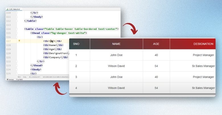
Can I Use Bootstrap Table Classes Inside WordPress Table Block?
The default WordPress table block doesn’t support Bootstrap classes directly. If you want to use Bootstrap features, you’ll need to use the Custom HTML block instead. That way, you can add the classes and design the table as you like. It gives you more control over the layout and design.
How Do I Add Hover Effects to My Bootstrap Table in WordPress?
You can add a hover effect by using the “table-hover” class inside your table code. This makes the row highlight when someone moves their mouse over it. It works well when you’re using the Custom HTML block. Make sure your WordPress theme or plugin supports Bootstrap for it to work.
Can I Use Bootstrap Table With Page Builders Like Elementor?
Yes, you can add Bootstrap tables with Elementor using HTML widgets. Simply paste your Bootstrap table code into the widget, and it will show on the page. Be sure your theme allows Bootstrap for the styles to work properly. You may also need to add custom CSS for full control.
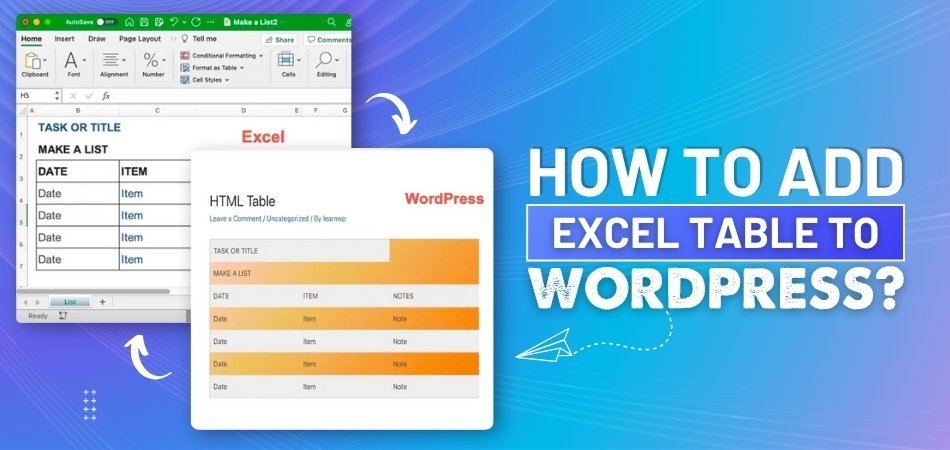
Is It Possible to Import Bootstrap Table Data From Excel?
Yes, many plugins allow you to import data from Excel files. You can use plugins like WP Table Builder or wpDataTables to do this. After importing, you can apply Bootstrap styles if the plugin supports it. This is great for saving time when working with large data.
What File Types Can I Use to Upload Data for My Table?
Most plugins let you upload CSV, Excel, or even Google Sheets files. These files are easy to make and edit on your computer. After uploading, the table will show the content in rows and columns. This helps when you already have data saved somewhere else.
How Can I Make My Table Match My Website Colors?
You can change the table colors by using custom CSS or plugin settings. Most tools let you pick colors for the background, text, and borders. If you use Bootstrap classes, you can also use built-in color options like “table-primary or table-dark”. This helps your table look more like your site.
What Happens If I Use Two Table Plugins Together?
Using two plugins at the same time can cause design problems. They might not work well together and break your table layout. It’s better to pick one plugin that does everything you need. This keeps your website clean and avoids loading too many tools.
Can I Show or Hide Table Columns Based on Screen Size?
Yes, some advanced plugins allow this feature using responsive settings. You can choose which columns to show on desktop and which to hide on phones. It helps make your table easier to read on small screens. This makes your table more user-friendly for all devices.
Do I Need to Update My Plugin to Keep Tables Working?
Yes, keeping your plugin updated is important to avoid bugs and errors. Updates fix old problems and bring new features. If your plugin is too old, some parts of your table may not work correctly. Always check for updates in your WordPress dashboard.
End Note
Creating a Bootstrap table in WordPress can be done quickly and easily using different methods like the built-in table block, plugins, or custom HTML. This guide has shown you various tools and techniques, giving you all the answers on how to make Bootstrap table in WordPress in a straightforward way.
To make your tables look great and function smoothly, remember to always keep them responsive, clean, and well-styled. Test them across devices and platforms to ensure a perfect user experience. Best of luck with your table creations!
_348.jpg)